
JEB’ GvFC Knight’s Pen
Background…
If you didn’t read the main page about my GvFC pens, here’s a recap…
As a custom pen maker, I’m called on to make a variety of pen styles, so I have to be on the ready. One way I try to hone my pen making skills is to challenge myself with a uniquely styled pen. I like to find a pen with a unique style, then try to replicate it.
This summer I ended up making THREE pens, all from the same company named Graf von Faber-Castell (GvFC). The pens are from a collection they call their Pen of the Year series. The first two pens were the Aztec and Ancient Egypt. This pen, called The KNIGHT’S was the third in this years skills challenge.
About the Knight’s Pen…
Of all the GvFC POY pens, I thought the Knight’s pen offered a variety of skill challenges–AND be the hardest to execute: I had to create the variety of engraving patterns;; I had to figure out how to put the fullers in the barrel; and put the ruby stone in the end of the barrel. In the beginning I had no idea how I was going to accomplish some of them, only that I wanted to try.
How to begin?
Like the Aztec pen, GvFC used special materials and coatings that gave the pen its unique look. So the biggest challenge for the Knights pen was selecting material that would represent the spirit of the original pen. The images on GvFC’s website shows a light brown material. But GvFC’s own information about the pen says the finish mimics anthracite, which is dark gray. After searching for other (non-GvFC images and viewing a few video’s, I found that the color is closer to black than brown.
Main material…
I search for some dark gray, but wasn’t able to find any. I found some wooden blanks that were labeled as black dyed infused curly maple (infused with acrylic to make it harder), so I ordered some of that to try. But it turned out to be much too light. So in the end, I decided to just use black. I considered giving it a matte finish by cutting back the polishing so it looked more gray, but it just didn’t look right. So I settled for the gloss black.
Section color…
The Section is suppose to mimic a brown leather wrapped sword handle. I had a few shades of brown acrylic that came close, and after some tests, I ultimately choose one called chocolate brown and paired it with a piece of clear acrylic to make the ink-view window.
Main barrel color…
The more I look at the Knight’s pen barrel, the more familiar it looked. But I couldn’t put my finger on what it was. And it kept bugging me. In the meantime, I thought I’d try using hard maple, then dying it back to go with the curly maple. I thought I could adjust the dye to make it lighter than the curly maple.
Making the parts…
Usually when I make a pen, I start with the barrel. With the Knight’s Pen barrel, I had to do two glue-ups, one at each end of what I call the main barrel. The first for the capping threads, the other for the Blind-cap. Since the purpose of this pen was figuring out how to do the various features, I decided to make a C/C pen, so the blind-cap was a glued on piece rather than threaded. The GvFC pens usually have a functioning blind cap that gives you access to the knob for the pistion filler. So I proceeded with the barrel glue up.
Eureka moment…
I was out on the deck making burgers for supper, when it finally dawned on me what the Knight’s barrel reminded me of! It looks just like the composite material that I used on my decking! It’s a composite material called Veranda. Its gray, and has a woodgrain pattern engraved into the surface. The woodgrain pattern and the color looks just like the Knights barrel.
I have a bunch of leftover pieces of the Veranda, so I turned a piece round, then did an engraving test. It looked perfect! So I started over with the barrel and used a piece of the Veranda. And I think it looks great with the black accents.
Color note: The Veranda looks lighter and has a brownish tint to it in the photo’s. But it’s grayer than is shown in the photo’s. The engraving lines are brown (burnt wood chips?), but it’s not that pronounced. My guess is that the brownish color is burnt wood chips in the composite material and it’s reflecting more light in the photo’s.
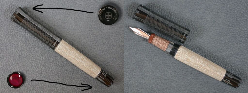
Barrel Fullers…
It was hard to take a photo that showed the barrel fullers. But they’re there! I cut them with a router and a 3/8″ bull-nose router bit and the same lathe platform I used for the Aztec cap. I originally thought I’d cut the crenels (the little notches around the ends of the cap and blind-cap) the same way. But after running some test, I found that I could make those with the engraver.
Engravings…
As you can see, the Knight’s pen has quite a variety of engraving patterns. Except for the fullers, all the various patterns were created with a diode engraver. The wrapped leather pattern on the Section was made with a stipple pattern and a combination of slanted lines to represent the edges of the wrap leather lines When creating patterns for round objects, you have to design the pattern FLAT. So the key in making the wrap lines was to make sure the bottom of one line lined up with the top of the line next to it.
The small squares around the edges at both ends of the pen are called Crenels. They’re suppose to mimic the cutouts around the top of a castle wall. I considered making those with a router and a flat top bit, but they worked out with the laser.
The wavy pattern on the cap was meant to mimic guilloche (also known as chainmail). There is also engraving on the top of the cap consisting of the company name and a medieval cross. I replaced the company name with my own, as well as updated the date.
Top it off with a red ruby…
The last feature the pen needed was the red ruby set into the end of the barrel blind-cap. I was able to find the exact size I needed on eBay.
Below are the dimensions for the Ancient Egypt fountain pen:
- Length:
>Capped: 5.45″ / 138.5mm
>Uncapped: 5.28″ / 134.2mm.
>Posted: 7.15″ / 181.7mm.
>Barrel only (less threads): 2.95″ / 74.9mm.
>Cap only: 2.40″ / 60.9mm.
>Section only: 1.04″ / 26.5mm. - Diameter:
>Cap max: .75″ / 19mm.
>Barrel max: .625″ / 15.8mm. - Weight (oz):
>Capped: 25.4.
>Uncapped: 17.0.
>Cap only: 8.6.
Summary
I hope you enjoyed the images and the story behind them. I apologize for the long pages, but I wanted detail the processes I went though while making the pens. They were definately challenging, but I learned a few new techniques, which was the purpose of the exercse.
")
")
")
")
")
")